Exporting Data From a VMware vSphere Environment For Fun And Profit
In this post we will see how we can export data from a VMware vSphere environment from the command-line and then plot some nice graphs of it, because everybody loves graphs, right? :)
For exporting of data from a VMware vSphere environment we are going to use vPoller - VMware vSphere Distributed Pollers and for plotting of the graphs we will be using matplotlib.
For installation and configuration of vPoller please refer to the
vPoller Github repository
which contains all the details you need in order to get vPoller
installed and configured.
So, without further ado let’s start with the interesting stuff.
Using vPoller we can export data in various formats using the
vPoller Helpers. Example of such a helper is the
vpoller.helpers.csvhelper which returns data in CSV format, which
makes it easy for us to then use that data for plotting graphs.
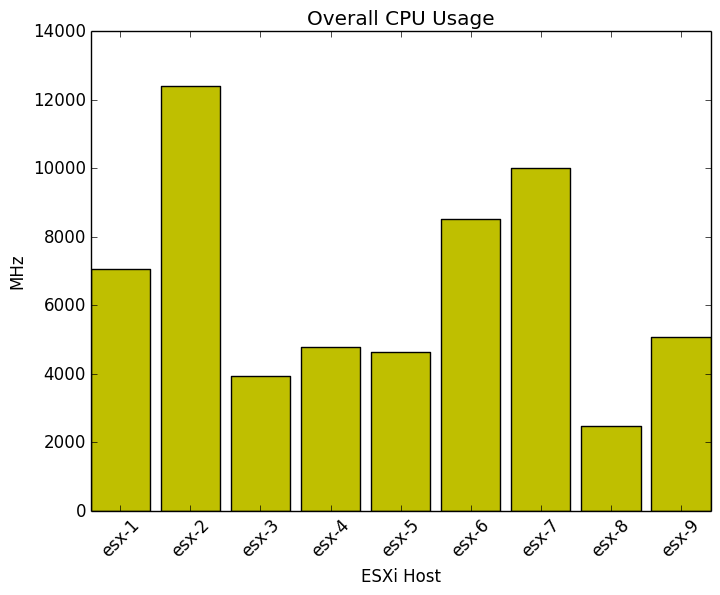
Let’s first check the overall CPU usage of our ESXi hosts from our vSphere environment:
$ vpoller-client -m host.discover -p summary.quickStats.overallCpuUsage -V vc01.example.org
{
    "msg": "Successfully discovered objects",
    "result": [
        {
            "summary.quickStats.overallCpuUsage": 7065,
            "name": "esx-1"
        },
        {
            "summary.quickStats.overallCpuUsage": 12383
            "name": "esx-2"
        },
        {
            "summary.quickStats.overallCpuUsage": 3945,
            "name": "esx-3"
        },
        {
            "summary.quickStats.overallCpuUsage": 4776,
            "name": "esx-4"
		},
        {
            "summary.quickStats.overallCpuUsage": 4638,
            "name": "esx-5"
		},
        {
            "summary.quickStats.overallCpuUsage": 8520,
            "name": "esx-6"
		},
        {
            "summary.quickStats.overallCpuUsage": 10001,
            "name": "esx-7"
		},
        {
            "summary.quickStats.overallCpuUsage": 2481,
            "name": "esx-8"
	},
        {
            "summary.quickStats.overallCpuUsage": 5064,
            "name": "esx-9"
	},
    ],
    "success": 0
}
The result returned by default from vPoller is in JSON format. In
order to convert this result to CSV we will use the
vpoller.helpers.csvhelper helper. Let’s do that now:
$ vpoller-client -H vpoller.helpers.csvhelper -m host.discover -p summary.quickStats.overallCpuUsage -V vc01.example.org
name,summary.quickStats.overallCpuUsage
esx-1,7065
esx-2,12383
esx-3,3945
esx-4,4776
esx-5,4638
esx-6,8520
esx-7,10001
esx-8,2481
esx-9,5064
We would also want to save this data in a file somewhere, so later we can use it to plot our graph of overall CPU usage.
$ vpoller-client -H vpoller.helpers.csvhelper -m host.discover -p summary.quickStats.overallCpuUsage -V vc01.example.org > hosts-cpu-usage.csv
Great, we’ve just exported the overall CPU usage of our ESXi hosts, but that is just some raw data.
The following script uses matplotlib in order to plot the graph for us.
#!/usr/bin/env python

import numpy as np
from matplotlib import pyplot as plt

def main():
    data = np.genfromtxt(
        fname='hosts-cpu-usage.csv',
        delimiter=',',
        dtype=None,
        skip_header=True
    )

    hosts = [row[0] for row in data]
    usage = [row[1] for row in data]

    index = np.arange(len(data))
    width = 0.85

    plt.xlabel('ESXi Host')
    plt.ylabel('MHz')

    plt.title('Overall CPU Usage')
    plt.xticks(index + width / 2.0, hosts, rotation=45)

    plt.bar(index, usage, width, color='y')
    plt.savefig('esx-cpu-usage.png', bbox_inches='tight')

if __name__ == '__main__':
    main()
And here is the result from our script:
Wait, it would be really usefuly if could see what is the CPU usage compared to our total CPU resources. Can we do that?
Sure, we can!
But first let’s export some additional properties from our vSphere environment:
$ vpoller-client -H vpoller.helpers.csvhelper -m host.discover -p summary.quickStats.overallCpuUsage,hardware.cpuInfo.numCpuCores,hardware.cpuInfo.hz -V vc01.example.org > hosts-cpu-usage-2.csv
The command above will export the following information about our ESXi hosts:
- Number of CPU cores
- CPU speed per core
- Overall CPU usage
This is the data we’ve just exported from our VMware vSphere environment using vPoller:
hardware.cpuInfo.hz,hardware.cpuInfo.numCpuCores,name,summary.quickStats.overallCpuUsage
2800098945,8,esx-1,7065
2800098378,8,esx-2,12383
2800098399,12,esx-3,3945
2800098483,12,esx-4,4776
2800099092,8,esx-5,4638
2800098504,8,esx-6,8520
2800098903,16,esx-7,10001
2800098252,16,esx-8,2481
2800098399,8,esx-9,5064
Now we can plot our graph which shows the overall CPU usage compared to the total CPU resources we have:
#!/usr/bin/env python

import numpy as np
import matplotlib.pyplot as plt

def main():
    data = np.genfromtxt(
        fname='hosts-cpu-usage-2.csv',
        delimiter=',',
        dtype=None,
        skip_header=True
    )

    cpu_speed = [row[0] / 1000000.0 * row[1] for row in data]
    cpu_usage = [row[3] for row in data]
    hosts     = [row[2] for row in data]

    index = np.arange(len(data))
    width = 0.85

    plt.xlabel('ESXi Host')
    plt.ylabel('MHz')

    plt.title('CPU Usage')
    plt.xticks(index + width / 10.0, hosts, rotation=45)

    p1 = plt.bar(index, cpu_speed, width, color='g')
    p2 = plt.bar(index, cpu_usage, width, color='y')

    plt.legend(('CPU Speed', 'CPU Usage'), loc='center left', bbox_to_anchor=(1, 0.5))

    plt.savefig('esx-cpu-usage-2.png', bbox_inches='tight')

if __name__ == '__main__':
    main()
And here is what the result looks like:
Pretty nice, isn’t it? Now we can get an overview of how our ESXi hosts are performing.
Okay, let’s try out something different now. Let’s check our datastores.
First we export Datastore properties using vPoller for capacity
and free space.
$ vpoller-client -H vpoller.helpers.csvhelper -m datastore.discover -V vc01.example.org -p summary.capacity,info.freeSpace > datastores.csv
And this is the CSV file we got from the above command:
info.freeSpace,name,summary.capacity
55582916608,datastore-1,898721906688
949532753920,datastore-2,1599149680640
1631043190784,datastore-3,2299149680640
653556449280,datastore-4,751350841344
254283874304,datastore-5,1098721906688
128705363968,datastore-6,898721906688
296936527360,datastore-7,1198721906688
We are going to use this Python script in order to plot a graph for our datastores:
#!/usr/bin/env python

import numpy as np
import matplotlib.pyplot as plt

def main():
    data = np.genfromtxt(
        fname='datastores.csv',
        delimiter=',',
        dtype=None,
        skip_header=True
    )

    # The CSV file contains the datastore free space and capacity in bytes, so
    # we convert this to GB first
    free       = [(row[0] / 1073741824) for row in data]
    capacity   = [(row[2] / 1073741824) for row in data]
    datastores = [row[1] for row in data]

    index = np.arange(len(data))
    width = 0.85

    plt.xlabel('Datastore')
    plt.ylabel('GB')

    plt.title('Datastores')
    plt.xticks(index + width / 10.0, datastores, rotation=45)

    p1 = plt.bar(index, capacity, width, color='g')
    p2 = plt.bar(index, free, width, color='y')

    plt.legend(('Capacity', 'Free Space'), loc='center left', bbox_to_anchor=(1, 0.5))

    plt.savefig('datastores.png', bbox_inches='tight')

if __name__ == '__main__':
    main()
And here is the result from our script:
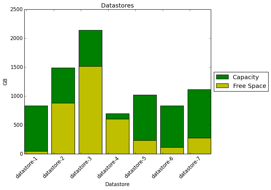
From the graph above we can see that some datastores would require attention soon, as we are running out of free disk space :)
Let’s check our Virtual Machines now. Using the Python script below we can get an overview of our environment and see how many of the Virtual Machines are running VMware Tools and how many are not.
First let’s export the Virtual Machines data from our vSphere
environment using vPoller:
``bash $ vpoller-client -H vpoller.helpers.csvhelper -m vm.discover -p guest.toolsRunningStatus -V vc01.example.org > vms-tools-state.csv
And here is the Python script we are going to use:

```python
#!/usr/bin/env python

import numpy as np
import matplotlib.pyplot as plt

def main():
    data = np.genfromtxt(
        fname='vms-tools-state.csv',
        delimiter=',',
        dtype=None,
        skip_header=True
    )

    # Get the Virtual Machines state of VMware Tools
    vm_states = {}
    for item in data:
        name, state = item[1], item[0]

        if state in vm_states:
            vm_states[state].append(name)
        else:
            vm_states[state] = [name]

    # Calculate percentage
    total_vms = len(data)
    labels    = sorted(vm_states)
    sizes     = []

    for state in labels:
        num_vms    = len(vm_states[state])
        percentage = float(num_vms) / float(total_vms) * 100.0
        sizes.append(percentage)

    # Get the index of the larger slice in the pie
    explode   = [0 for n in xrange(len(labels))]
    max_index = sizes.index(max(sizes))
    explode[max_index] = 0.1

    plt.pie(
        sizes,
        explode=explode,
        labels=labels,
        autopct='%1.1f%%',
        shadow=True,
        startangle=90
    )

    plt.axis('equal')
    plt.savefig('vms-tools-state.png')

if __name__ == '__main__':
    main()
And here is the result from our script:
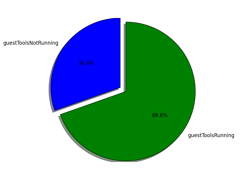
Oh boy, seems like we do have a significant number of Virtual Machines that we need to take care of and get VMware Tools up and running there.
As a last example we will see how to get and overview of the Operating Systems we run in our environment.
First let’s export some data from our VMware vSphere environment using
vPoller:
$ vpoller-client -H vpoller.helpers.csvhelper -m vm.discover -p config.guestFullName -V vc01.example.org > vms-os-type.csv
Now we will use this Python script which would give us an overview of the Operating Systems we run in our environment:
#!/usr/bin/env python

import numpy as np
import matplotlib.pyplot as plt

def main():
    data = np.genfromtxt(
        fname='vms-os-type.csv',
        delimiter=',',
        dtype=None,
        skip_header=True
    )

    os_types = {}
    for item in data:
        os, vm = item[0], item[1]

        if os in os_types:
            os_types[os].append(vm)
        else:
            os_types[os] = [vm]

    # Calculate percentage
    total_vms = len(data)
    labels    = sorted(os_types.keys())
    sizes = []

    for os in labels:
        num_vms    = len(os_types[os])
        percentage = float(num_vms) / float(total_vms) * 100.0
        sizes.append(percentage)

    # Get the larger slice from the pie
    explode   = [0 for n in xrange(len(labels))]
    max_index = sizes.index(max(sizes))
    explode[max_index] = 0.1

    plt.pie(
        sizes,
        labels=labels,
        explode=explode,
        shadow=True,
        startangle=90,
        autopct='%1.1f%%'
    )

    plt.axis('equal')
    plt.savefig('vms-os-types.png', bbox_inches='tight')

if __name__ == '__main__':
    main()
And this is how the result from our script looks like: